
wxHelper is a progam that creates help files compatible with wxWidgets help system.
This help file was created with it!
The topmost toolbar holds buttons that control the main file operations.
The Left panel has its own toolbar and a tree control that holds the topic structure of the help file.
Clicking on the links above will open the help pages which explain the operation of each section of the program.
Back to TopThe buttons activate the following functions:
| Button | Label | Function |
|---|---|---|
 |
New | Creates a new project or saves the current one |
 |
Open | Opens an existing project. |
 |
Generate | Generates a help file from the current project 1 |
 |
Document | Creates a single html file with all the pages in the project 2 |
 |
Translate | Helps creating a translated version of the project |
 |
Test | Opens the Help Viewer. When activated it will be empty, the desired help file is opened by clicking on the leftmost button in its toolbar. |
 |
Help | Show this help file (also by pressing F1). |
 |
About | Shows information about the program |
 |
Exit | Ends the program. |
1 When generating the help file, all help pages from the project database and the necessary auxiliary files will be created in a directory with the same name as the project file, and then compressed in a .htb file in the same directory.
2 The html file will be created in a directory with the same name as the project file.
Back to Top
The buttons on this panel's toolbar perform the following operations in the tree control under it:
| Button | Label | Function |
|---|---|---|
 |
New folder | Adds a new folder under the current topic |
 |
New topic | Adds a new page under the current topic |
 |
Edit | Edits the label of the topic |
 |
Copy | Copies the current topic and all descendants to memory |
 |
Paste | Pastes the previously copied topic and all descendants under the current item - after pasting, the original is deleted, since there can be no duplicate IDs in the help file |
 |
Delete topic | Deletes the topic and all descendants |
 |
Move up | Moves the current topic and all descendants up |
 |
Move down | Moves the current topic and all descendants down |
When a new topic is added, the code editor is activated, and initialized with a template empty page
Back to TopThis panel has two tabs. The first tab shows a simple html code editor, the second a simple html viewer that allows quickly checking how the code entered in the editor will look like.
Text can be entered directly in the code editor, including the subset of html tags that are understood by the html help.
The code editor has its own toolbar, with four buttons that activate pop-up menus with various html shortcuts.
These shortcuts do not cover all the tags that can be used; for more information on those, see Tags and Parameters.
Each pop-up menu has its own help page, accessible by the links below
| Button | Label | Pop-up Menu |
|---|---|---|
 |
Character | Font and other characteristics |
 |
Format | Text formatting |
 |
Lists | Create lists |
 |
Links | Insert various types of link |
 |
Color | Selects a color and inserts it in the code editor |
 |
Tag | Inserts a generic tag and optional parameter(s) in the code editor |
Most of those operations will use the selected text as part of the html code, or will insert dummy items as examples if nothing is selected.
Each menu option can alternatively be activated by an Alt-Key combination, also shown in the menu.
Once opened, the menu is automatically closed by clicking on one of the options or pressing ESC.
Back to Top| Menu Item | Alt-Key | Function |
|---|---|---|
| Bold | B | Makes the font bold |
| Italic | I | Makes the font italic |
| Underline | U | Makes the font underlined |
| Font | F | Allows setting color and size of the font |
| Menu Item | Alt-Key | Function |
|---|---|---|
| Header | 1 | Inserts a header (h1 by default) |
| Ruler | R | Inserts a ruler |
| Code | [ | Displays text in monospace font. If multiple lines are selected, each line will have a break added at the end |
| Center | C | Centers text |
| Paragraph | P | Creates a paragraph. If multiple lines are selected, each line will have a break added at the end |
| Line break | K | Adds a hard line break. If multiple lines are selected, each line will have a break added at the end |
| Table | T | Creates a table |
| Menu Item | Alt-Key | Function |
|---|---|---|
| Unordered | N | Creates a bullet list |
| Ordered | O | Creates a list without bullet |
| List definition | L | Creates a list with a header and item indentation |
To create any of those lists, enter each item on a separate line, select all the lines and then activate the corresponding option.
Back to Top| Menu Item | Alt-Key | Function |
|---|---|---|
| Hyperlink | H | Inserts a hyperlink |
| Image | M | Inserts an image |
| Anchor | A | Inserts an anchor (place in text that can be reached by a hyperlink in the same page beginning with #) |
For both hyperlinks and anchors, if a part of the text is selected, it will be used in the corresponding dialog box as the text for the link.
The dialog box has a dropdown list with all the page ids in the current project (at the moment it is invoked; topics added after will not show, obviously).
When an image link is inserted, the corresponding image will be copyed to the same directory where the help file is generated and saved in the project file as wel, so that the project database will have all the necessary elements to build the help file. Only this file (the .hlpdb file) needs to be backed up , if necessary.
Back to Top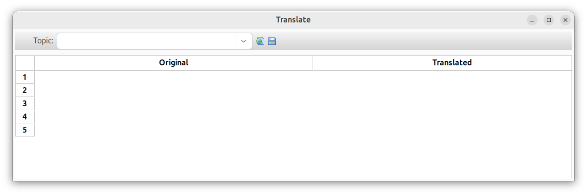
| Button | Label | Function |
|---|---|---|
|
View | Shows the current page with the translated text |
|
Save | Saves the translated project |
The combobox on the lop left area of the window holds all the topic names in the project.
When an item is chosen, its text is parsed an all text that is not within html tags is extracted.
The extracted text will be shown on the right column in the grid.
When a row is clicked, the Translate item window will open.
That window allows entering a translation for the original string.
Clicking on the View button will show how the translated version looks, you can check progress
as you translate.
After translating all the text in all items, you can generate a new help project
clicking on the Save button
Note: The translation process is far from perfect. If you have written text in English, for instance,
describing a button and setting its name to bold, the name and description would be separated, in that order.
If the translation is into a Romance Language, again as an example, adjectives should come after the object,
so the description would look odd because it would retain the English order with the adjective first.
Hence, you will sitll have to rework it a bit after the new version is generated.
Just open the newly generated project and edit the necessary items - it is still easier than starting from scratch.
After opening the new project for the first time it is advisable to generate the help file for the first time, so that all images will be available.
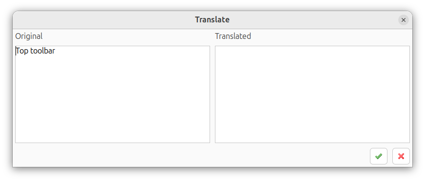
The left side of the screen will show the origial text. You should enter the translation on the right and press the OK button, if you are satisfied, or the Cancel button, to abandon it.
A tag has general form of tagname param_1 param_2 ... param_n
where param_i is either paramname="paramvalue"
or paramname=paramvalue - these two are equivalent.
Parameters and tags are case-insensitive.
| Tag | Parameter |
|---|---|
| a | name=[string] |
| href=[url] | |
| target=[target window spec] | |
| address | |
| area | shape=poly |
| shape=circle | |
| shape=rect | |
| coords=[coords] | |
| href=[url] | |
| b | |
| big | |
| blockquote | |
| body | text=[color] |
| link=[color] | |
| bgcolor=[color] | |
| br | align=[alignment] |
| center | |
| cite | |
| code | |
| dd | |
| div | align=[alignment] |
| dl | |
| dt | |
| em | |
| font | color=[color] |
| bgcolor=[color] | |
| size=[fontsize] | |
| face=[comma-separated list of facenames] | |
| hr | align=[alignment] |
| size=[pixels] | |
| width=[percent|pixels] | |
| noshade | |
| h1, h2, ..., h6 | |
| i | |
| img | src=[url] |
| width=[percent|pixels] | |
| height=[pixels] | |
| align=texttop | |
| align=center | |
| align=abscenter | |
| align=bottom | |
| usemap=[url] | |
| kbd | |
| li | |
| map | name=[string] |
| meta | http-equiv="content-type" |
| content=[string] | |
| ol | |
| p | align=[alignment] |
| pre | |
| samp | |
| small | |
| span | |
| strike | |
| strong | |
| sub | |
| sup | |
| table | align=[alignment] |
| width=[percent|pixels] | |
| border=[pixels] | |
| valign=[v_alignment] | |
| bgcolor=[color] | |
| cellspacing=[pixels] | |
| cellpadding=[pixels] | |
| td | align=[alignment] |
| valign=[v_alignment] | |
| bgcolor=[color] | |
| width=[percent|pixels] | |
| colspan=[pixels] | |
| rowspan=[pixels] | |
| nowrap | |
| th | align=[alignment] |
| valign=[v_alignment] | |
| bgcolor=[color] | |
| width=[percent|pixels] | |
| colspan=[pixels] | |
| rowspan=[pixels] | |
| title | |
| tr | align=[alignment] |
| valign=[v_alignment] | |
| bgcolor=[color] | |
| tt | |
| u | |
| ul |
These substitutions are used in tags descriptions:
| Parameter | Values |
|---|---|
| [alignment] | center |
| left | |
| right | |
| justify | |
| [v_alignment] | top |
| bottom | |
| center | |
| [color] | html 4.0-compliant colour specification |
| [fontsize] | -2 ... 7 |
| [pixels] | integer value that represents dimension in pixels |
| [percent] | i% (where i is integer) |
| [url] | an url |
| [string] | text string |
| [coords] | c(1), c(2),c(3),...,c(n) (where c(i) is integer) |